Aspect Ratio: What It Is and Why It Matters
Aspect ratio defines the shape of every visual experience you encounter. It is simply the proportional relationship between the width and height of an image or screen.
These two numbers dictate how a video fits on a massive cinema display or a vertical smartphone screen. Ignoring these proportions often results in distorted subjects, distracting black bars, or pixelated crops that ruin a perfect shot.
Mastering the math behind the frame allows you to control exactly how an audience sees your work.
The Fundamentals Of Aspect Ratio
Aspect ratio forms the mathematical foundation of every image you see. It defines the constraints of the frame and dictates how a viewer experiences visual content.
While the concept might seem technical at first glance, it is actually quite simple once you break down the relationship between the numbers and the physical screen.
Decoding The Numbers
You will almost always see aspect ratios written as two numbers separated by a colon, such as 16:9 or 4:3. This syntax represents the width compared to the height.
The first digit always refers to the width of the image, while the second digit refers to the height.
It is vital to recognize that these figures represent a proportional shape rather than a specific physical measurement. A 1:1 ratio describes a perfect square regardless of if that square is on a smartwatch or a billboard.
The numbers tell you the relationship between the dimensions, not the size of the canvas itself.
Aspect Ratio vs. Resolution
People often confuse aspect ratio with resolution, yet they are distinct concepts that work together. Aspect ratio refers to the proportions of the frame, while resolution refers to the total number of pixels contained within that frame.
Consider the difference between a standard High Definition (HD) screen and a 4K screen. An HD display typically uses a resolution of 1920×1080 pixels, while a 4K display uses 3840×2160 pixels.
Despite the massive difference in pixel count and clarity, both share the exact same 16:9 aspect ratio. You can scale an image up or down in resolution without changing its fundamental shape.
Visualizing The Shapes
Different ratios create distinct geometric shapes. A 1:1 ratio creates a perfect square, which offers a balanced and static feel often associated with social media profile pictures.
A 4:3 ratio produces a standard rectangle that looks slightly boxy, reminiscent of older television sets. In contrast, a 16:9 ratio creates a wider rectangle that mimics the human field of view, making it the standard for immersive video content.
Standard Aspect Ratios In Film And Hardware
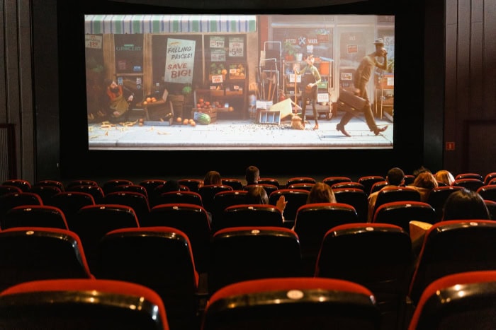
The history of screens and cinema has left us with a few dominant standards. These specific proportions evolved through decades of technological shifts and compromises between broadcast requirements and artistic intent.
Knowing which standard applies to your project ensures your content fills the screen correctly.
16:9: The Widescreen Standard
This is the format you likely encounter most often. 16:9 serves as the universal standard for modern high-definition televisions, computer monitors, and online streaming platforms like YouTube.
It gained dominance because it acted as a mathematical compromise. When the industry moved from analog to digital, engineers needed a format that could comfortably display both narrow classic TV shows and wide cinematic movies with minimal wasted space.
Today, it is the default setting for almost all video recording devices.
4:3: The Legacy Standard
Before widescreen took over, 4:3 was the king of broadcast. This boxy shape defined the era of CRT televisions, classic sitcoms, and standard-definition cable.
While it largely vanished from living rooms in the mid-2000s, it remains relevant in specific contexts.
Apple uses a ratio close to 4:3 for its iPad line because the boxier shape works better for reading and web browsing than a wide rectangle. Additionally, filmmakers occasionally return to this format for artistic reasons.
Movies like The Lighthouse or Zack Snyder's Justice League utilize 4:3 to create a sense of verticality or to evoke a nostalgic, claustrophobic atmosphere.
21:9: The Cinematic Standard
If you have ever noticed black bars on the top and bottom of your TV while watching a blockbuster movie, you are looking at a cinematic ratio. often referred to as 2.35:1 or 2.39:1, these “ultrawide” formats are designed to capture vast landscapes and elaborate action sequences.
Hardware manufacturers have recently embraced this format with 21:9 ultrawide monitors. These screens are popular among video editors who need extra timeline space and gamers who want a wider field of view for a more immersive experience.
The Vertical Revolution

The rise of the smartphone changed how the world consumes video. For the first time, vertical orientation became the primary way people view content.
Platforms like TikTok, Instagram, and Snapchat forced creators to abandon traditional horizontal filming techniques in favor of tall, narrow frames.
9:16: Full Screen Vertical
This ratio is simply the standard 16:9 widescreen format turned on its side. It dominates short-form video content on TikTok, Instagram Reels, and YouTube Shorts.
Because users hold their phones vertically 94% of the time, content produced in 9:16 fills the entire display and commands full attention.
Recording natively in this format is crucial. Taking a horizontal video and cropping it to vertical results in a significant loss of resolution and often cuts out essential details from the sides of the frame.
4:5 And 1:1: Feed Optimization
While 9:16 rules the “stories” and full-screen feeds, other ratios perform better in scrolling news feeds.
- 1:1 (Square): This was the original Instagram standard. It remains the easiest format to manage because it displays consistently across almost every device and platform without unexpected cropping.
- 4:5 (Portrait): This slightly taller vertical format is ideal for posts that appear in a scrolling feed. It occupies more vertical screen real estate than a square or a horizontal image, which effectively pushes competitors off the screen and keeps the user's attention on your content for longer.
Safe Zones And UI Elements
Creating for mobile requires more than just getting the shape right. You must also account for the user interface (UI).
Unlike a movie theater screen, a mobile screen is covered in buttons, captions, like counters, and comments.
These elements usually sit at the bottom and right side of the screen. If you place your subject or crucial text too low, the platform's interface will obscure it.
Experienced creators utilize “safe zones,” typically the center of the screen, to ensure their focal point remains visible regardless of the specific phone model or app overlay.
Aspect Ratio In Photography And Printing
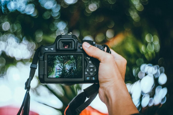
Photography operates on a different set of standards than the video world. While screens have become wider over time, still images have largely retained the boxier shapes of the 20th century.
This disconnect between camera sensors, physical prints, and digital displays requires photographers to make deliberate choices about how they frame their subjects.
Sensor Native Ratios
The physical sensor inside a camera dictates the starting aspect ratio of every photograph. Most dedicated cameras rely on two specific formats.
- 3:2: This ratio serves as the standard for DSLRs and mirrorless cameras. It directly descends from 35mm analog film. It produces a slightly wider rectangle that balances well for both horizontal and vertical shots.
- 4:3: This format is standard for Micro Four Thirds cameras and the vast majority of smartphones. It is boxier than the 3:2 ratio. Phone manufacturers prefer it because it utilizes the circular image projected by the lens more efficiently than a wider sensor would.
The Print Problem
One of the most frustrating challenges in photography arises when moving from a digital file to a physical print. Camera sensors and standard paper sizes rarely match perfectly.
For example, a standard 8×10 inch piece of paper has a 5:4 aspect ratio. Neither the 3:2 ratio of a DSLR nor the 4:3 ratio of a smartphone fits this paper size naturally.
If you try to print an unedited photo on 8×10 paper, you will inevitably have white space on the sides or you will have to crop significant portions of the image. This mismatch forces photographers to compose their shots loosely, leaving extra space around the edges to account for future trimming.
Compositional Impact
The shape of the frame significantly influences the mood of the image. A photographer might choose a specific crop to change how the viewer perceives the scene.
A 1:1 square frame feels balanced, stable, and centered. It draws the eye directly to the middle of the image.
In contrast, a wide panoramic crop feels dynamic and expansive, leading the viewer's eye across the horizon. Choosing the right ratio is just as important as choosing the right lens; it defines the boundaries of the story you are telling.
Managing Mismatches
You often notice aspect ratio most when it goes wrong. When the shape of the content does not match the shape of the display, the hardware must compromise.
This usually results in black bars, lost image data, or distorted subjects.
Letterboxing And Pillarboxing
The most common solution to a mismatch is adding black bars to fill the empty space. This technique preserves the original image without cutting anything off, though it leaves parts of the screen unused.
- Letterboxing: This occurs when you watch a widescreen movie on a narrower screen. Black bars appear on the top and bottom to accommodate the width of the film.
- Pillarboxing: This is the reverse of letterboxing. It happens when you view older 4:3 content, such as a classic TV show, on a modern widescreen TV. Black bars appear on the left and right sides to fill the width of the display while maintaining the original boxy shape.
Cropping vs. Scaling
If you want to eliminate black bars, you must alter the image itself. There are two ways to do this, and both come with significant downsides.
Cropping involves zooming in on the image until it fills the screen. This is often labeled as “Zoom to Fill” in TV settings.
While it removes the black bars, it cuts off the edges of the video, potentially removing characters or important visual details.
Scaling involves stretching the image to fit the boundaries of the screen. This forces a narrow image to fill a wide screen (or vice versa) by distorting the geometry.
The result is squashed or stretched subjects. People might look unnaturally wide or tall.
This is generally considered the worst way to view content as it ruins the original composition.
Content Adaptation
Professional editors use more sophisticated techniques to repurpose content for different screens. The most famous method is “Pan and Scan,” frequently used to adapt wide cinema movies for older square televisions or, more recently, to adapt horizontal videos for vertical social media feeds.
Instead of a static center crop, the editor creates a virtual window that slides across the original footage. This window follows the action, ensuring the most important visual elements remain in the frame.
This allows a horizontal video to exist in a vertical format without losing the focus of the scene, though it still requires sacrificing the peripheral details of the original shot.
Conclusion
Aspect ratio is simply the geometry of the frame. It remains distinct from resolution, yet it dictates how every pixel is displayed.
There is no universally superior format. A cinematic widescreen works perfectly for a theater but fails completely on a vertical smartphone feed.
The right choice always depends on your specific device, platform, or artistic intent. Always verify platform requirements or hardware specifications before you begin a project or purchase a new display.
Paying attention to these proportions ensures your content looks exactly the way you intended, without unwanted distortion or empty black space.
